Print Room & Framing Blog
The Gallery Wall you’ve always wanted
Share this article:
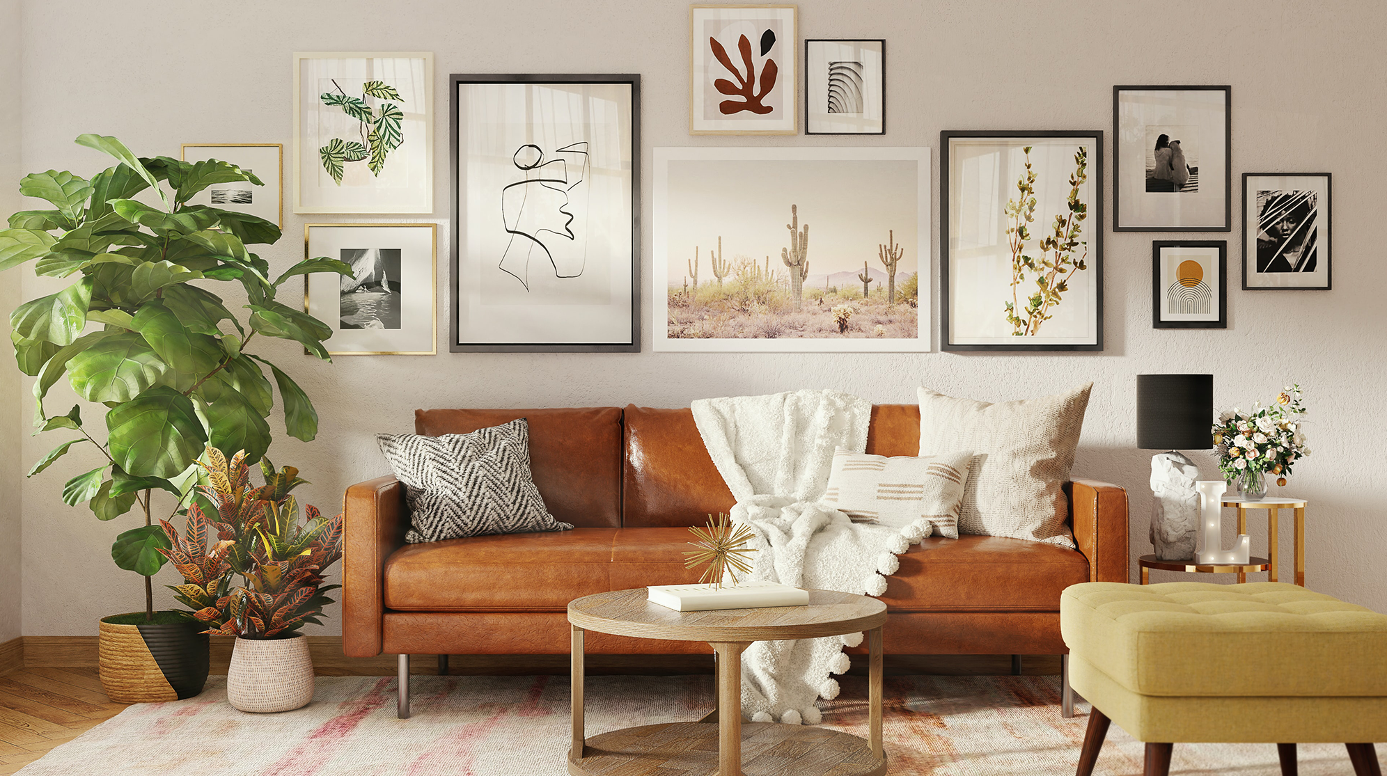
Let’s take a dive into some basic considerations when planning your wall layout – it’s time to think outside the frame.
Colour
Your room will most likely have some form of colour theme, or when decorating from scratch, you might be starting with a stark white empty canvas. Either way, it is best to start by creating a basic palette of colours you would like to draw on for your gallery wall.
Don’t overwhelm yourself by trying to create something from scratch. Gather images of interiors or gallery walls that you like. There is no harm in taking elements from external sources and making them your own. This helps to simplify the process and will give you a head start.
Next, create a visual swatch. Make use of paint sample swatches, brochures from local hardware stores, fabric cut-offs, magazine cut-outs, pieces of wood, etc., and compile them into a visual storyboard. When possible, create a backdrop to your colour arrangement that is the same colour as the wall where you will be hanging. Make sure the colours work together and/or boldly complement each other. Using one unified pop of colour throughout the room will subtly help to pull your look together.
When selecting frames or prints, the showroom at Orms Print Room & Framing is full of amazing samples. We have a mirror table so you can lay out all the different colours and finishes and view them as if they were on your wall. This is a big help in visualising what your finished pieces will look like.
Keep to a theme
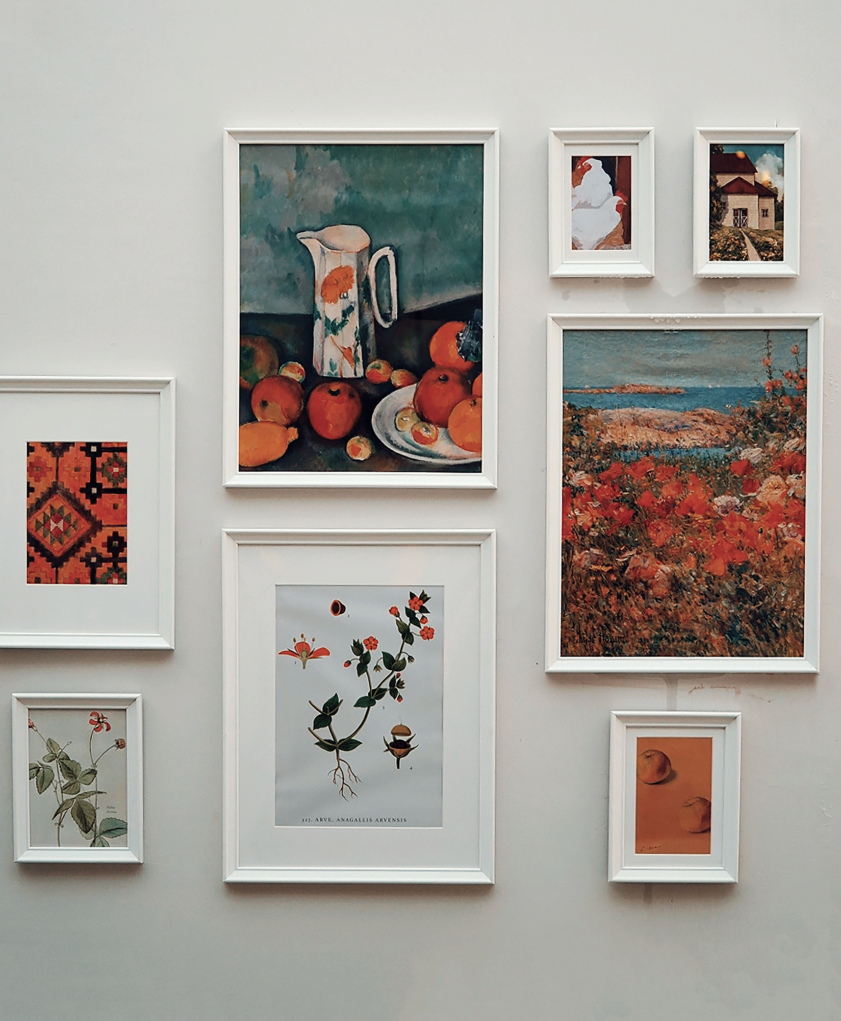
A theme may be as broad as vintage or modern. Alternatively, you can narrow it down to a more concentrated theme that purely involves a colour like yellow or a theme like plants or the seaside. The theme will help convey a feeling or idea to the viewer and can set the mood for the space. It is a vital part in planning and ensures a cohesive, thought-out finish. A theme with a central concept will always appear more “put-together”.
Horizons and Vertices
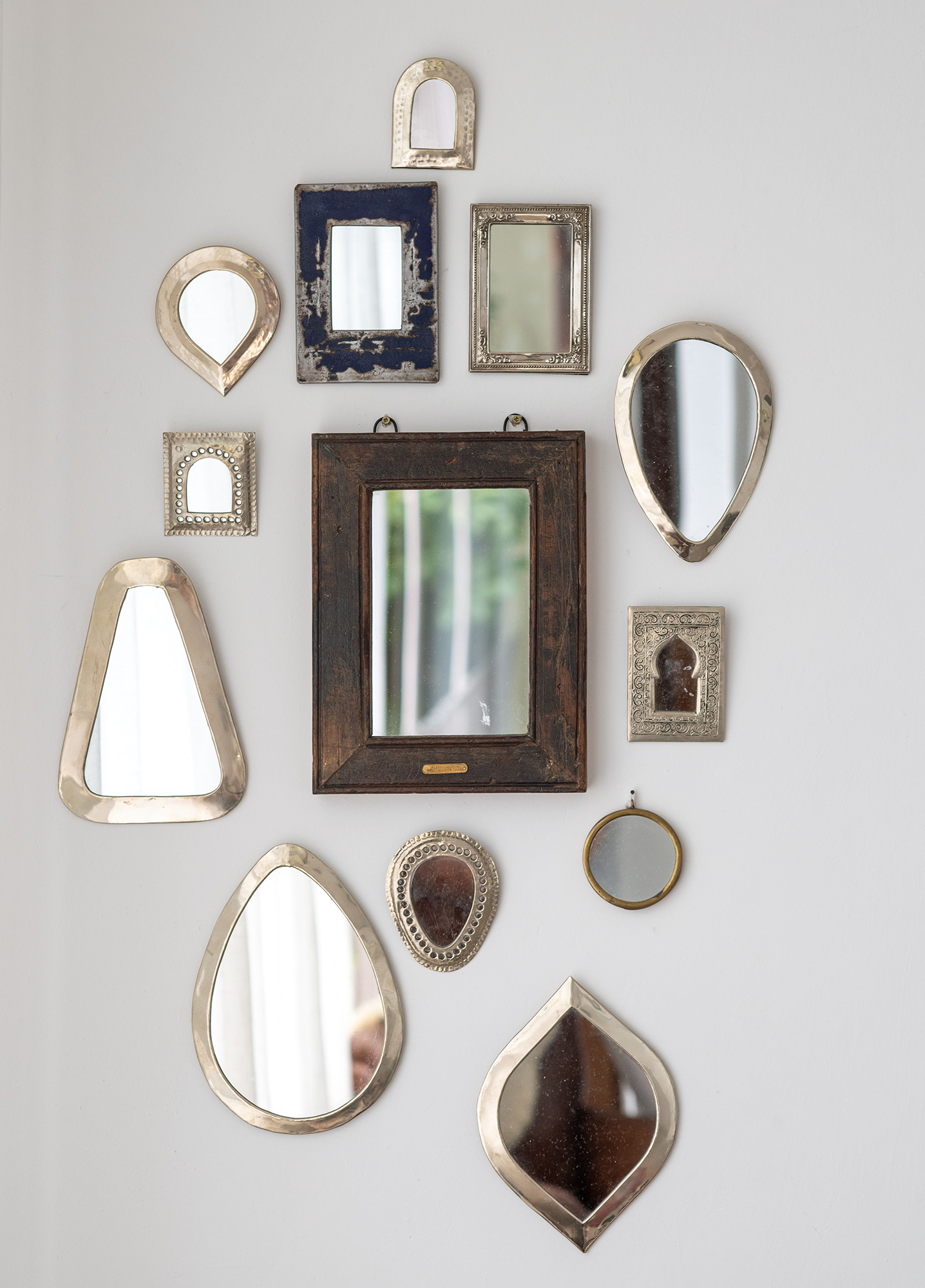
Don’t be afraid to play with unconventional heights and placements. The more items a gallery wall contains, the more loosely they can be placed. There are no set rules with wall layouts but a few simple guidelines should be followed within the layout. The most important guideline, which we will never disregard, is even spacing between frames. Try your best to keep the frames evenly spaced throughout for a polished look. Naturally, good frame height is around eye-height but a gallery wall layout normally calls for more unconventional hanging heights and spacing to utilise the entire wall area.
Play dress-up
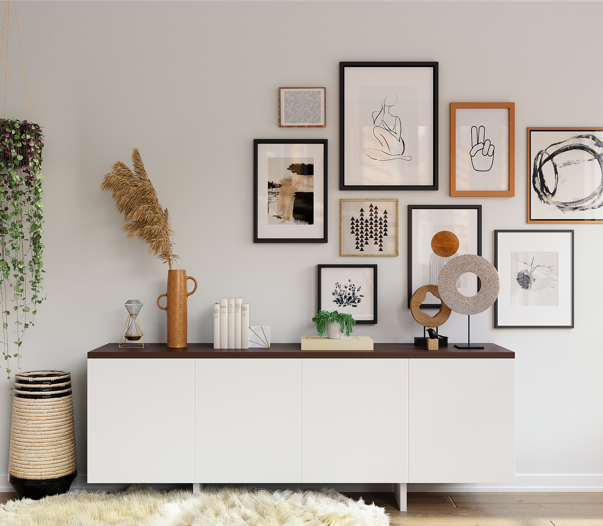
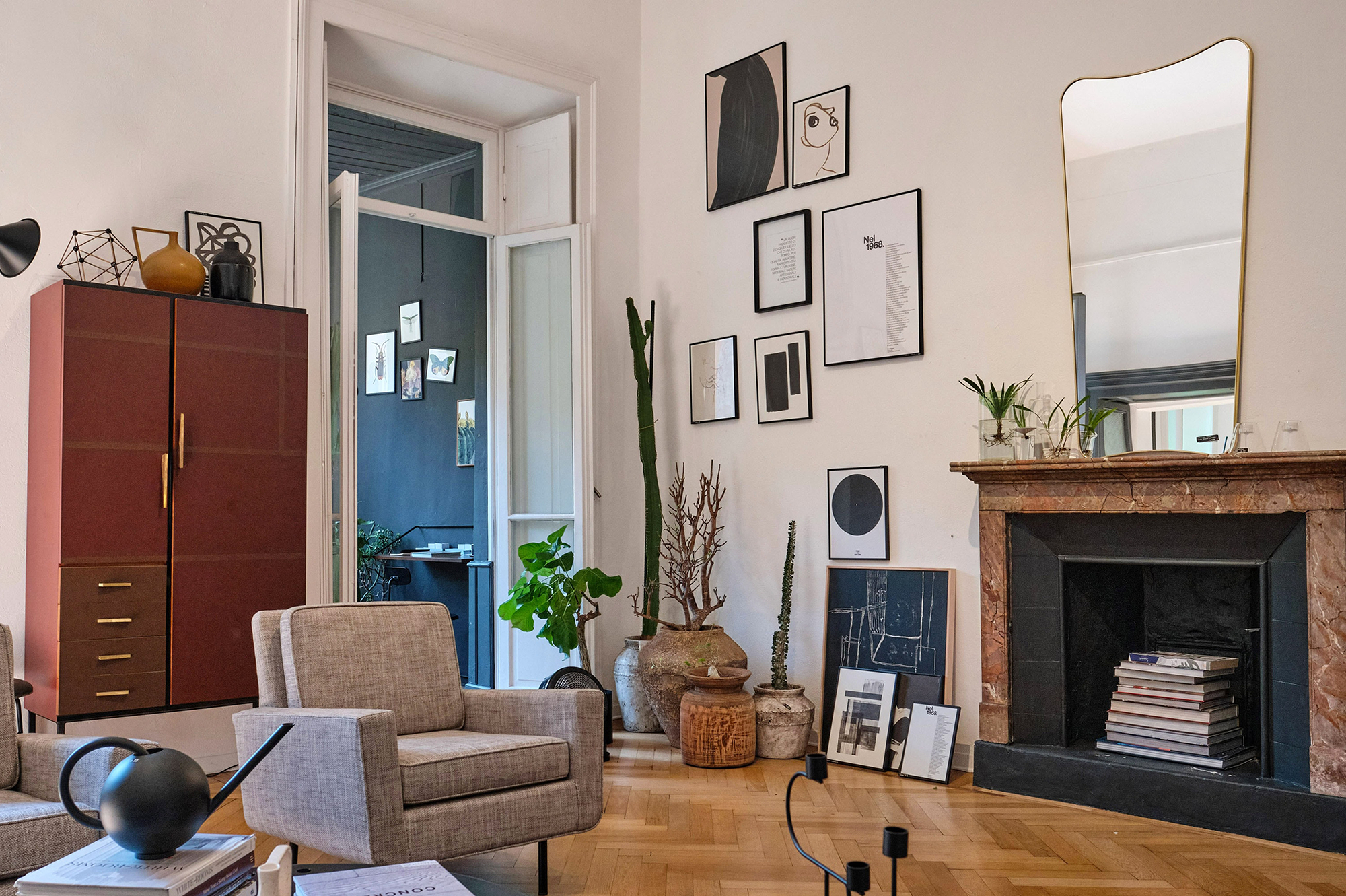
Our homes and spaces are already filled with so many obscure objects such as TV’s, fireplaces, speakers, plants, tray tables, etc. Plan your gallery wall around these items and include them in the layout from the beginning. Poor placement of a radio, couch or plant, after a gallery wall has gone up, can haunt you for a lifetime. With correct placement, an eye-sore can be turned into something beautiful. Even that bold black panel, we call a television, can be photo-ready with a few simple placement considerations.
Be creative
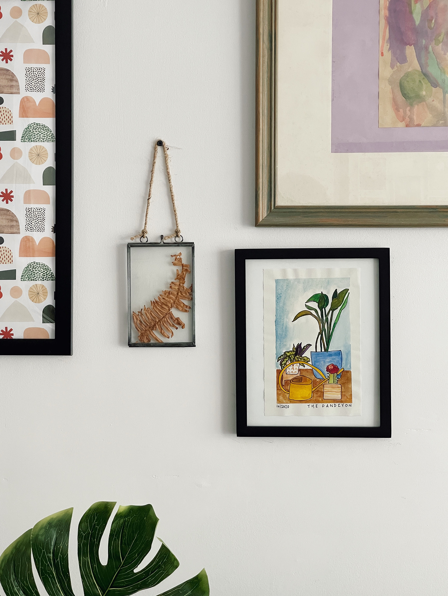
Your gallery wall is not limited to frames. Try to introduce unique and playful elements. Plants and other three-dimensional items can easily be added in between frames to add some texture and depth into your gallery wall. A good double-sided tape or nylon gut can be used to hang these items just as you would any frame. Empty frames, with no glass or backing boards, also add a sophisticated element to your walls. Something like a simple leaf adhered to the wall can be framed by an empty frame – this is a great way to upcycle old and vintage frames that are otherwise outdated and unusable.
Size and Layout
The most daunting part of planning your gallery wall is the layout and spacing. It really doesn’t need to be – it is actually the simplest part of the process! We recommend two age-old techniques:
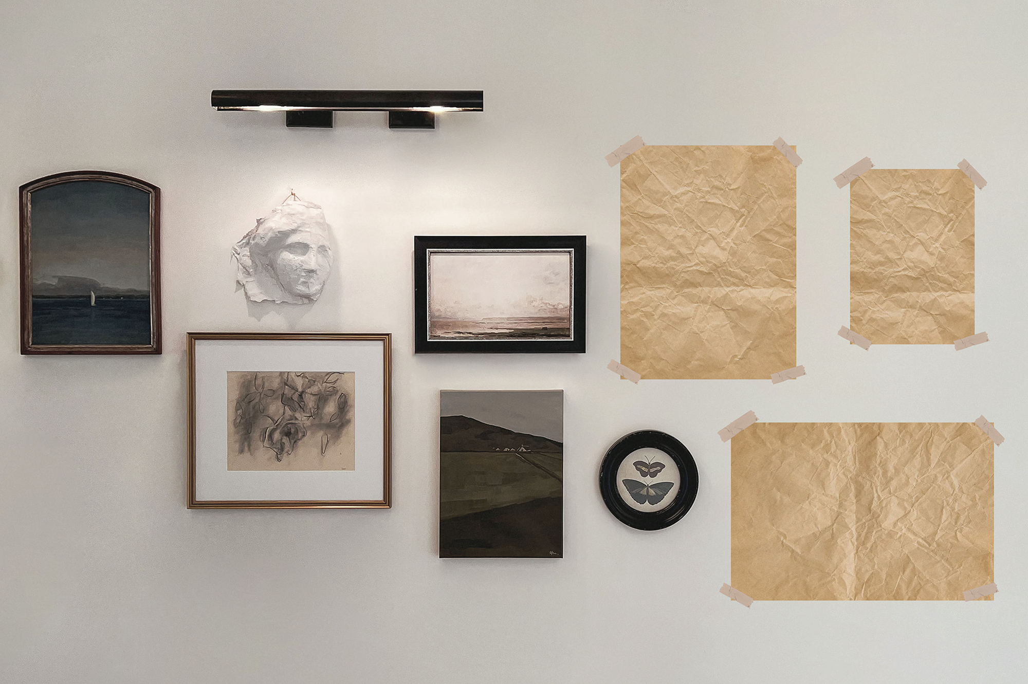
1. Once you have all your elements together, take old newspaper, office paper or pieces of cardboard and cut them to match the size of all your frames and other elements. It’s a good idea to label them if you have multiple pieces of the same size. Now you can simply stick them on your wall with masking tape (the white or yellow tape that is used to mark off areas for painting works best). This is one of the best ways to visualize and play around with the layout on your wall without leaving any marks or permanent damage on the wall surface. Once you are happy with the layout, you can use more masking tape to mark the edges of all the frames – this will help with the installation of the hanging hardware and ensure that your frames are hung where intended.
2. If you are more experienced and you are happy to wing the installation, we still recommend that you lay out all your frames on the floor with the correct spacing in between. Using this method allows you to not only visualize the final layout but also helps you to obtain a complete outer measurement of all your grouped frames so you can plan the installation of the hanging on your wall. You do not want to start hanging on one side of your wall and then run out of space on the other!
If you need a professional to assist with any form of installation, you can reach out to our local expert, Steyn Kotze from Picture Hanging Pro’s, at [email protected]
The consultants at Orms Print Room & Framing have all developed a keen-eye for wall layouts and interior design. We assist clients with interiors on a daily basis, advise on correct placements and make recommendations on styling, finishes and product groupings. Come visit us and give it a try! Besides, where else can you get everything from prints and frames to wallpaper and custom printed textiles under one roof.


